
Power Plants and Neighboring Communities
The following sections are presented below:
Overview
Burning fossil fuels at power plants creates emissions of sulfur dioxide (SO2), nitrogen oxides (NOX), particulate matter (PM), carbon dioxide (CO2), mercury (Hg), and other pollutants. NOX and SO2 emissions contribute to the formation of ground-level ozone and fine PM, which can lead to respiratory and cardiovascular problems, and exposure to mercury can increase the possibility of health issues ranging from cancer to immune system damage.
On January 27, 2021, Climate Day, President Biden issued an Executive Order, entitled “Tackling the Climate Crisis at Home and Abroad”, that addresses climate change policy and environmental justice.
The power sector has significantly reduced many of these pollutants over the past two decades, but important health and environmental concerns persist.
Minority, low-income, and indigenous populations frequently bear a disproportionate burden of environmental harms and adverse health outcomes, including the development of heart or lung diseases, such as asthma and bronchitis, increased susceptibility to respiratory and cardiac symptoms, greater numbers of emergency room visits and hospital admissions, and premature deaths.
EPA is committed to Environmental Justice (EJ) - the fair treatment and meaningful involvement of all people. To help answer questions about environmental justice in the communities around power plants, information on the following six key demographics (e.g., demographic indicators) and demographic index (average of low-income and people of color populations) is presented below through interactive maps and graphs:
- Low-income population
- People of color,
- Population with less than high school education,
- Linguistically isolated population,
- Population under age 5, and
- Population over age 64.
These key demographics and information about nearby fossil fuel power plants can be used as a general indicator of a community’s potential susceptibility to these types of environmental exposures.
Mapping Power Plants and Neighboring Communities
There are over 3,400 fossil fuel-fired power plants in the United States. For each plant, EPA summarized population percentages of six key demographics and demographic index for the neighboring communities located within three miles of each plant.
A three-mile radius is consistent with environmental justice literature and studies, including the EJ Screening Report for the Clean Power Plan. These key demographics and information about nearby power plants may help identify a community's potential vulnerability to environmental concerns.
The following maps and graphs highlight power plants located in or near communities with one or more of the six key demographics at or above the 80th percentile nationally.
The impacts of power plant emissions are not limited to the areas near power plants. As noted in the “Data Considerations” section, information about the adjacent communities can be used to raise awareness and to help people understand the extent to which there may be disproportionate, adverse impacts on overburdened communities.
If a community is at or above the 80th percentile nationally, it means that the community's population for a given demographic (for example, low-income) is an equal or higher percentage than where 80% of the U.S. population lives.
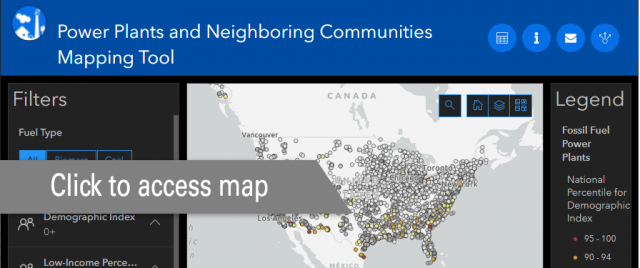
Map of Power Plants and Neighboring Communities
The following map identifies the locations of power plants and highlights the key demographics of people living within three miles of those plants. The map displays all fossil fuel-fired power plants that supply electricity to the grid.
You can filter the plants displayed on the map based on demographics, plant characteristics such as size and fuel type, and quantity of annual plant-level emissions of SO2, NOX, CO2, and PM2.5. For example, you could filter the data to only display the largest emitting coal-fired plants with neighboring communities above the 80th percentile nationally of low-income population.
Additional layers which can be toggled on/off include power plant emissions, area demographics, and tribal areas.
Some layers are not visible until the map is zoomed in. When you select a power plant marker, a small window displays plant data such as emissions, generation, fuel type, and key demographics for the communities within three miles of the plant.
The Power Plants and Neighboring Communities Mapping Tool can be accessed by clicking the image below.

More information about the data used in the map can be found here.
Graphing Power Plants and Community Demographics
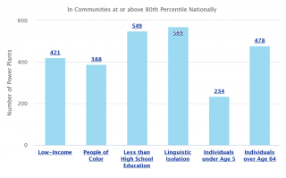
Graphs below summarize the key demographics of communities within three miles of power plants.
Number of Plants in Communities by Key Demographic
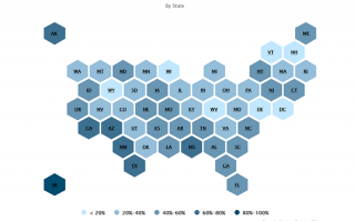
Key Demographics by State
The following map displays the percentage of plants within each state that are in communities with at least one key demographic at or above the 80th percentile nationally. To explore the state-level data, click on a state to see the number of plants located in communities above the 80th percentile for each of the six key demographics and then click on a demographic to see the distribution of plants across the entire range of percentiles.
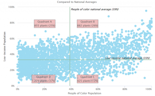
Compared to National Averages
In the graph below, the low-income (vertical axis) and the people of color (horizontal axis) are plotted for the communities around each U.S. fossil fuel-fired power plant. The national averages of low-income population and the people of color population are drawn as reference lines for comparison.
- Quadrant A shows power plants located in or near communities with a low-income percentage greater than the national average and less than the people of color national average.
- Quadrant B shows power plants located in or near communities with both a low-income percentage and people of color percentage greater than the national averages.
- Quadrant C shows power plants located in or near communities with a people of color percentage greater than the national average and a low-income percentage less than the national average.
- Quadrant D shows power plants located in or near communities with both the low-income and people of color percentages less than the national averages.
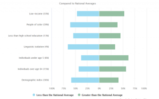
Key Demographics at Plants
The graph below compares the key demographics of communities near power plants to national averages. For each demographic, the percentages of these communities within three miles of a power plant greater than and less than the national averages are displayed.
The national average for each demographic is shown in parentheses. The percentage of plants located in or near communities with an average greater than the national average is on the right side of the graph (green). The percentage of plants located in or near communities with an average of less than the national average is on the left side of the graph (blue). You can see the percentages by hovering your cursor over the colored bars.
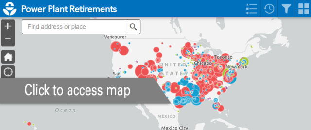
Mapping Power Plant Retirements
Many fossil fuel-fired power plants (especially coal-fired power plants) have announced plans to retire, based on data collected by the Energy Information Administration (EIA). This generating capacity may likely be replaced by natural gas-fired power plants and renewable energy sources, such as wind and solar. Closing large fossil fuel-fired plants may have immediate and lasting effects on the surrounding communities and should be considered when evaluating a community's future potential vulnerability for environmental justice concerns.
The interactive map below shows recent and announced retirements of coal, natural gas, oil, and other fuel combustion power plants. The color of the marker indicates fuel type and the marker size represents nameplate capacity (MW) of the retired power plant or unit.
The Power Plant Retirements map can be accessed by clicking the image below.
Additional Graphs and Data
Explore additional graphs that show distributions of generation and emissions for each of the demographics. In addition to the data presented in these maps and graphs, a Power Plants and Neighboring Communities (xlsx) spreadsheet presents all the information available through EPA's environmental justice mapping and screening tool, EJSCREEN.
Data Considerations
It is important to note that the impacts of power plant emissions are not limited to a 3-mile radius. Because pollution can travel over long distances from a power plant, the impacts of both potential increases and decreases in power plant emissions can be felt many miles away, meaning that the air quality in a community can be due to far-distant sources as well as those sited within a community.
Still, being aware of the characteristics of communities closest to power plants is a starting point in understanding the potential sources of pollution that may impact a community and how changes in a power plant’s air emissions may affect the air quality experienced by some of those already vulnerable to environmental burdens.
Potential Health Impacts
Burning fossil fuels to produce electricity creates emissions of sulfur dioxide (SO2), nitrogen oxides (NOX), particulate matter (PM), carbon dioxide (CO2), mercury (Hg) and other hazardous air pollutants (HAPs), and other pollutants. Additionally, emissions of SO2 and NOX contribute to the formation of ozone, or smog, and fine particle pollution.
Populations found to be particularly vulnerable to environmental pollution include the poor, the elderly, the very young, those already in poor health, and/or indigenous populations.
These pollutants are known to contribute to adverse health outcomes, including the development of heart or lung diseases, such as asthma and bronchitis, increased susceptibility to respiratory and cardiac symptoms, greater numbers of emergency room visits and hospital admissions, and premature deaths. See the health effects of ozone and particulate matter pollution. Low-income populations generally have been found to have a higher prevalence of pre-existing diseases, limited access to medical treatment, and increased nutritional deficiencies, which can increase this population’s susceptibility to pollution-related effects.
Learn More
If you would like to learn more about these key demographics or further explore relationships between power plants and environmental justice, investigate EPA's EJSCREEN. It is an environmental justice screening and mapping tool that utilizes standard data to highlight places that may have higher environmental burdens and vulnerable populations. It is based on nationally consistent data and uses an approach that combines environmental indicators and demographics in maps and reports.
To access this combined power plants and neighboring communities data in the EJSCREEN mapping tool, from the mapping tool menu:
- Select "Tools",
- Select "Search for Maps",
- Select "Search Geoplatform",
- Type in keywords to query the entry such as "power plants and neighboring communities" (with quotations),
- Select "Add", and
- Exit out of the "Search Geoplatform" window.
More information can also be found on the Frequent Questions about Power Plants and Neighboring Communities page and in the Power Plants and Neighboring Communities Webinar.